Chapters


Visualizing Data Part 1
Calculating Mean in the Real World
If you open any book or website on beginner’s statistics, one of the first concepts you will encounter is the mean. In fact, finding the average of a data set is one of the first statistical concepts we learn in elementary school. However basic the mean may seem, it’s actually one of the most powerful concepts statistics has to offer.Averages are used in everything from economics to sports entertainment. In fact, it may just be the most popular statistic used on a daily basis. The reason for this popularity can be found in its simplicity. Everyone can understand what an average is and how it’s calculated. The average strives to represent the most “typical” value of a data set and can be a quick way of understanding a large amount of observations.
In economics and national accounting, the mean is used in order to compare information about the economy and finances across years or countries. Some popular indicators using mean include:
- Average wage
- Mean income
If you’re interested in comparing the standards of living across country, you are most likely to use indicators such as mean income and average rent costs. Averages can even be found in the burgeoning field of esports, where players can follow indicators such as average competitive rank, average player rating, and more.
However, simple averages can often hide hidden truths within a data set. As we explored in earlier sections, sometimes using other measures of central tendency are better than using the mean. To recap, the general rules of thumb for deciding whether to use mean or median can be summarized in the following:
- If your data are approximately normally distributed, the mean is representative
- If your data have a significant amount of outliers or some skew, the median is preferred
Just like when we’re deciding what measure of central tendency we should use over another, we should also take an equally as deliberate and insightful approach to applying means to our research. In the following problem, you’ll understand why using a simple mean can sometimes be inadequate.
Problem 1: Mean by Variable
There are many reasons why you may want to dig deeper into a particular average. Some examples of variables you may want to explore are:
- Average time spent on the internet by age
- Average wage by occupation
- Average response by survey method
| Observation | Country | Women 100 m Sprint Time |
| 1 | America | 9.7 |
| 2 | America | 10.1 |
| 3 | America | 9.9 |
| 4 | America | 11.1 |
| 5 | America | 9.6 |
| 6 | Canada | 11.8 |
| 7 | Canada | 10.4 |
| 8 | Canada | 11.3 |
| 9 | Canada | 10.0 |
| 10 | Canada | 10.5 |
| 11 | Jamaica | 9.5 |
| 12 | Jamaica | 9.5 |
| 13 | Jamaica | 9.3 |
| 14 | Jamaica | 10.0 |
| 15 | Jamaica | 11.2 |
| 16 | France | 9.9 |
| 17 | France | 9.9 |
| 18 | France | 10.9 |
| 19 | France | 10.6 |
| 20 | France | 9.0 |
| 21 | Nigeria | 9.7 |
| 22 | Nigeria | 10.4 |
| 23 | Nigeria | 9.5 |
| 24 | Nigeria | 9.9 |
| 25 | Nigeria | 11.4 |
Solution Problem 1: Mean by Variable
In this problem, you were presented with two tasks:
- Find the mean for the data set
- Find the mean for each country
First, we calculate the mean for the entire data set. This is a task we’ve done before, simply using the equation for finding sample means.
\[
s = \dfrac{255.2}{25}
\]
\[
=10.2
\]
Now, in order to find the mean by country, we simply take the average only of the times corresponding to a particular country. The sample size is 5 for each country.
| America | \[ s = \dfrac{50.4}{5} =10.1 \] |
| Canada | \[ s = \dfrac{54}{5} =10.8 \] |
| Jamaica | \[ s = \dfrac{49.5}{5} =9.9 \] |
| France | \[ s = \dfrac{50.3}{5} =10.1 \] |
| Nigeria | \[ s = \dfrac{50.9}{5} =10.2 \] |
Finding the mean for each country tells us important information. The fastest average sprint time for the 100 meter spring for women is in Nigeria. This slowest average time is held by Canada. Here, we can see how finding the mean of each category, instead of just the mean of the entire data set, reveals the performance of each individual country.
Visualizing Mean
In the previous sections, you encountered different types of visualizations. Visualizations come in all different types and sizes, some of the most common and basic ones including:
- Bar charts
- Pie charts
- Histograms
- Scatterplots
As you’ve seen, there are many different ways to convey data. Often, reporting numbers can be cumbersome and can be equally as difficult to read and comprehend. Visualizations allow us the ability to express information about our data efficiently and, simultaneously, report any patterns we may find.
You may be wondering in what cases we might want to visualize something like the mean. Often, plotting the mean into some type of chart can help us make comparisons across time, between countries or between variables. One real-life example is a visualization you may have seen before: average rainfall by month.
Being able to record and plot this data in a bar chart can be more helpful in revealing patterns we may otherwise not have noticed or may have had trouble understanding. Plotting average rainfall by month helps us notice seasonal patterns, which are common in a time series, or a data set listed in order of time.
Sometimes, plotting measures can be the quickest way to understand your data or to supplement your understanding of specific measures, like the average. In the next problem, you’ll be able to see why.
Problem 2: Visualizing the Mean
Sometimes, plotting the mean in a chart or graph can be a better way of communicating the mean. Often, however, the hardest part about displaying data is choosing which type of visual to use.
The data below is a fictitious list of mean sprint times for several countries. Given the choice between the following, select the type of visual would you choose to present this data:
- Histogram
- Pie Chart
- Bar Chart
- Line Graph
| America | 10.1 |
| Canada | 10.8 |
| Jamaica | 9.9 |
| France | 10.1 |
| Nigeria | 10.2 |
| Ivory Coast | 10.7 |
| Portugal | 10.4 |
| Trinidad and Tobago | 11.7 |
| Russia | 10.9 |
| Italy | 10.4 |
| Barbados | 10.2 |
Solution Problem 2: Visualizing the Mean
While there are many other ways to visualize this data, out of the choices presented a bar chart would be the best method to display this data. A brief overview of why can be found below.
- Histogram: best used to display frequency
- Pie Chart: best for illustrating the makeup of categories within one variable
- Line Graph: best when you want to display a variable changing as a result of another
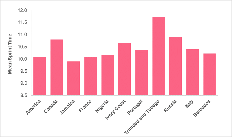
Here, a bar chart is ideal because we want to display one numerical variable for each value within the country category.
Did you like this article? Rate it!


Can you help me answer my activities