Chapters


Constructing a Bar Chart
In the previous sections, you learned some of the basics in calculating different statistical measures and displaying these figures. Here, you will learn the basics of what a bar chart is, how it’s constructed, and some practice problems to try on your own.
What is a Bar Chart?
A bar chart is one of the most basic, visual forms of presenting data. In general, there are four basic visualizations in statistics that are used every day in a diverse range of fields:
- Bar Charts
- Pie Charts
- Line Graphs
- Histograms
A bar chart is made up of columns positioned on an axis, where the vertical axis represents the amount of each column. Below, you’ll find an example of a bar chart.

Notice that the horizontal axis doesn’t have any units. This is because bar charts are typically used for presenting one qualitative and one quantitative variable. The horizontal axis displays the different values within a categorical variable and the horizontal axis displays a quantitative figure relating to that variable. There is one exception, which is when a bar chart displays time as a categorical variable, such as days of the week or years.
In the example above, we have one qualitative variable, cities, and a quantitative variable, which are the total population. Each city has a corresponding value on the horizontal axis, which represents the total population.
Bar Chart versus Histogram
Bar charts are often confused with histograms and looking at the picture below can help you understand why.
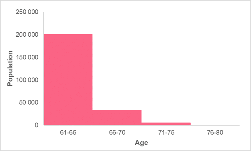
While they do appear to be similar, there are very major differences between the two charts. The main difference is that, as opposed to bar charts, histograms show information about two quantitative variables. In this image, instead of having the total population per city, we have the total population corresponding to different ages.
The histogram has a defined horizontal axis, where the further you move along it, the bigger the values become. Histograms are used to display the frequency of a certain variable, like population, while bar charts are used to compare a quantitative variable between different values of a categorical variable.
Bar charts typically display discrete information, while histograms present continuous information for the most part. This can be seen in the fact that, in the histogram, the bars, which are called “intervals,” are touching each other. In the bar chart, these are separate because each value within the categorical variable is distinct.
Histograms group quantitative variables together into intervals in order to give general information about the distribution of that variable quickly. Note that these intervals, also known as “bins,” can be changed.
Notice, as well, that in the histogram, the order of these intervals matter. It wouldn’t make sense to place people aged 60 and above before those aged 20. In a bar chart, the order of the bars doesn’t matter - the information makes sense regardless of which city comes before another.
In the table below, you’ll find the major differences between the two types of charts summarized.
| Characteristic | Histogram | Bar Chart |
| Vertical Axis | Quantitative variable | Quantitative variable |
| Horizontal Axis | Quantitative variable | Categorical variable |
| Bars | No space between them | Spaces between them |
| Order of Bars | Order matters | Order doesn’t matter |
Stacked Bar Charts
In statistics, you will encounter three different types of bar charts. The first, discussed above, is the simplest one and is just called a bar chart. The other two are a bit more complex and are called a stacked column chart and a 100% stacked chart.
A stacked column chart looks like the image below. The easiest way to understand a stacked column bar chart is to compare it to a simple bar chart. The bar chart is the same as the previous one, giving us the total population by country of three different cities. However, the stacked column chart displays another category: gender.

Looking at this side-by-side comparison, we can see that, ignoring the division within the stacked column chart, it looks exactly the same as the bar chart. That’s because it is the same. The only difference is that, within each total, you are dividing each category further into different categories.
For example, the total population of Edinburgh is the same in both charts. That makes sense, as the total represents both males and females in the population. However, for the stacked column chart, you give information on the total population of the city for males and females.
Comparing this to a 100% stacked chart, shown in the image below, we can see the main difference is that the vertical axis is now displayed as a percentage. The variable doesn’t change, the vertical axis still shows the total population. The only difference is that instead of showing the count of each value within the category of gender, the chart is showing the relative frequency of each value.
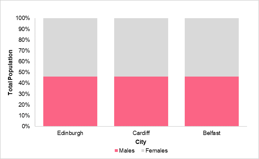
Discussed further in the section regarding frequency distributions, the relative frequency is found simply by dividing the amounts of females and males by the total population. This can be seen in the table below.
| City | Male | Female | Total |
| Edinburgh | 46% | 54% | 100% |
| Cardiff | 46% | 54% | 100% |
| Belfast | 46% | 54% | 100% |
Here are some rules you can follow when choosing which bar chart you want to use.
- Bar charts should be used when you want to compare categorical variables with one quantitative variable. It can also be used in place of a stacked column chart depending on how homogeneous the values are within each category.
- Stacked column bar charts should be used when you want to simultaneously show how totals change between categories while also showing the different makeup of the totals.
- 100% stacked bar charts should be used when you’re less interested in the total amounts and more interested in showing the relative frequencies, or proportions, of each category.
Did you like this article? Rate it!


Can you help me answer my activities