Chapters
Frequency Part 2
In other sections of this guide, we taught you how to calculate the frequency of a data set. Specifically, you learned about the differences between cumulative and relative frequency, as well as how these are usually presented. We also showed you some basic visualizations you can make with data. Here, we’ll show you how to visualize and interpret frequency.


Row and Column Frequency
As a reminder, the frequency of an observation is how often that thing occurs. In order to calculate the frequency of a variable, you simply need to count how many times it occurs, which is also known as the “count.”
Relative frequency is the frequency relative to the whole. There are two basic types of relative frequency, which deal with row and column frequencies. These two relative frequencies are best seen through an example. The table below lists the preference of three new soda flavours by gender.
| Female | Male | Other Gender | Total | |
| Flavour A | 398 | 556 | 146 | 1100 |
| Flavour B | 659 | 450 | 91 | 1200 |
| Flavour C | 230 | 300 | 470 | 1000 |
| Total | 1287 | 1306 | 707 | 3300 |
Simply looking at this table, you may have a hard time understanding which flavour people prefer. A better way of analysing these results may simply be to take the relative frequency by row, which is finding the proportion of each number by the total of its row.
| Female | Male | Other Gender | Total | |
| Flavour A | 398/1100 = 36% | 556/1100 = 51% | 146/1100 = 13% | 100% |
| Flavour B | 659/1200 = 55% | 38% | 8% | 100% |
| Flavour C | 230/1000 = 23% | 30% | 47% | 100% |
Looking at the results, we can see the relative frequency of each flavour by gender, or the preference of flavour between genders. Meaning, for flavour A, we can see that more males preferred this flavour. For flavour B, women preferred this flavour over all the other genders, and so on.
However, we can also calculate relative frequency for columns, which simply takes the value divided by the column total.
| Female | Male | Other Gender | |
| Flavour A | 398/1287= 31% | 556/1306= 43% | 146/707= 21% |
| Flavour B | 659/1287= 51% | 34% | 13% |
| Flavour C | 230/1287= 18% | 23% | 66% |
| Total | 100% | 100% | 100% |
As opposed to row relative frequency, the column relative frequency lets us know how the preference of flavour within each gender. For females, 51% preferred flavour B, 43% of males preferred flavour A and 66% of other genders preferred flavour C.
These tell us details about the specifics within each variable, whether it be for flavour type or for gender. Simple frequency will tell us only information about the data set as a whole. It is calculated by taking the value and dividing it by the total sample size.
| Female | Male | Other Gender | Total | |
| Flavour A | 398/3300= 12% | 556/3300=17% | 146/3300= 4% | 33% |
| Flavour B | 20% | 14% | 3% | 36% |
| Flavour C | 7% | 9% | 14% | 30% |
| Total | 39% | 40% | 21% | 100% |
The frequency allows us to understand the preferences of the whole data set. We can interpret and say there were more males than other genders in our data set, at 40%. More people, regardless of gender, preferred flavour B at 36%.
Visualizing Frequency
There are many different tools you can use to visualize data, which is simply taking information from data and transforming it into a visualization. The most basic data visualizations, and ones which you are probably very familiar with, are pie charts and bar charts.
Frequency is most commonly displayed as a histogram. In order to understand why, we can look at three ways to visualize frequency: dot plots, histograms and frequency polygons.
Dot plots
Dot plots are one of the most basic ways to visualize data and will give you a good understanding of how histograms are constructed. A dot plot essentially assigns one dot, or other symbol, as the number of times something occurs within a data set. The picture below is an example of a dot plot and shows how many fruits are found in a gift basket.
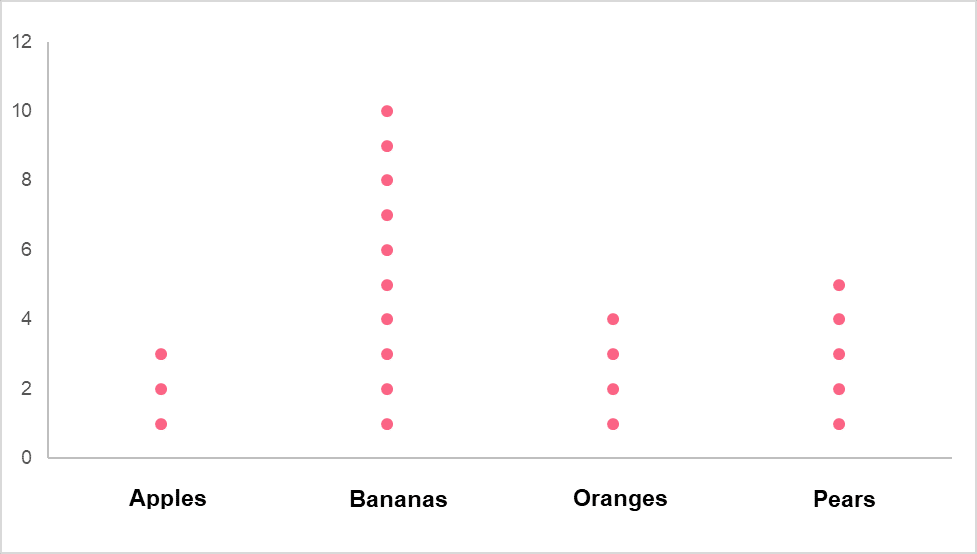
The table below provides an example of what this would look like in a tabular form.
| Category | Frequency |
| Apples | 3 |
| Bananas | 10 |
| Oranges | 4 |
| Pears | 5 |
A more advanced dot plot would show each dot, or symbol, as representing a certain number greater than 1. Let’s say that in the dot plot from the previous example, each dot was equal to 5 instead of 1. The dot plot would still look the same, however the frequency would now be equal to the table below.
| Category | Frequency |
| Apples | 15 |
| Bananas | 50 |
| Oranges | 20 |
| Pears | 25 |
We attain this by either counting each dot as multiples of 5, or by multiplying the total frequencies by 5.
Histograms
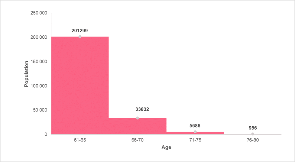
The construction of histograms was discussed in previous sections of this guide to descriptive statistics. However, as a reminder, histograms present a visualization of two quantitative variables. This means that we would not be able to visualize the previous example as a histogram.
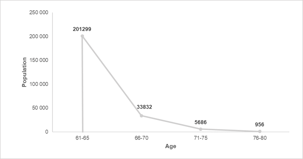
A histogram is made up of bars, which represent an interval of a quantitative variable on the horizontal axis and the frequency of this interval on the vertical axis. An example can be found in the image below.
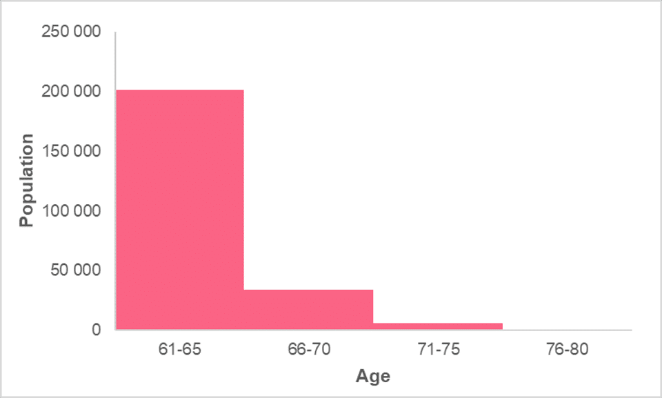
This is one of the most common ways to present frequency and can actually tell us a lot of information about a data set. The reason why this is the case is because a histogram tells us information about the distribution of the data.
Frequency Polygon
Frequency polygons are similar to area charts, both of which are used when trying to display changes of volume over time or compared to other categories. By hand, it is constructed first by taking the midpoint of each bar in a histogram and then connecting them. This can be seen in the images below.
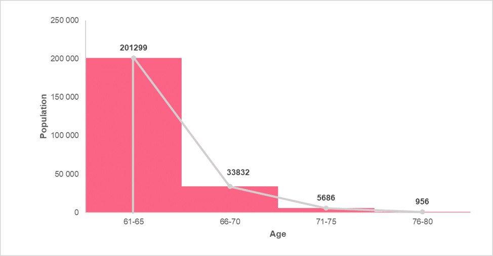
Next, we simply get rid of the histogram to arrive at the final display of information. This can be seen in the image below.
However, when the area under this line is shaded, it is considered an area chart, which looks like the image below.
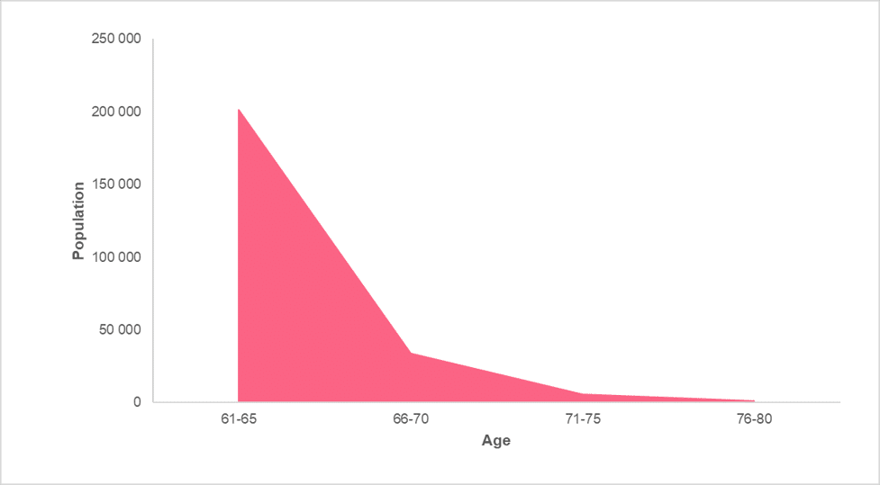
Notice that both the frequency polygon and the area chart are virtually the same.
Problem 1: Interpreting a Histogram
Now that you’ve learned how to construct a histogram, we will ask you to interpret a histogram. Using the histogram in the previous sections, what can you say about the age groups within the population? Below is the histogram for reference.
Solution to Problem 1
In this problem, the task was to:
- Interpret the histogram in terms of age groups
There are many things we can say about a histogram, which can be summarized in the following table.
| Characteristic | Interpretation |
| Relative sizes | Which groups of data are larger or smaller, in other words more or less frequent |
| Centre | Is there a centre point for the data and, if so, where is it located? |
| Spread | How far are the data points spread around the centre point of the data |
Given the following, we can come up with an interpretation for each characteristic. This could look like the following.
| Characteristic | Interpretation |
| Relative sizes | The largest age group are those aged 61-65 while the smallest is the 76-80 group. |
| Centre | There is a centre point to the data set. It is located to the right, where the centre is between the age groups 61-65 and 66-70. |
| Spread | The data is unevenly spread around the centre, where values to the left of the centre are much higher than those to the right. |
Did you like this article? Rate it!


Can you help me answer my activities