Chapters


Patterns in Data
It is estimated that there are about 5 to 10 thousand stars that are visible from the earth with the naked eye. A small fraction of those stars form the many constellations we grow up trying to search for in the night sky. While drawing a line through several points to things such as the big dipper or a zodiac sign are helpful in locating certain patterns in the sky, all stars taken as a whole form just one, giant blob of light.
If stars where the plotted points in a data set, we could try to conclude that there is no pattern. However, how exactly can you measure the strength of a particular, observed pattern? Say, for example, that you instead plot the mass of stars against their energy, or luminosity. You might observe that as the mass increases, so does the luminosity. You could then run a simple linear regression to obtain an equation that describes the statistical model between mass and energy.
This regression model would then describe the correlation, or strength of the relationship, between the two variables. While descriptive statistics can be helpful, statistical models such as this one can help us determine whether patterns in a data set exist beyond simply plotting them in a graph.
Correlation Definition
Correlation is a technique used in statistics to measure whether or not two variables are related or not. Examples of correlation appear all the time in the real world, dealing with everything from the possible relationship between weight gain and level of work activity to violence in video games and violence in life.
There are a couple of common correlation techniques, but it is worth mentioning that correlation can only be calculated between two quantitative, or numerical, variables. Correlation cannot be calculated, for example, between the names of birth months or brand names.
The most common correlation technique is product-moment, or Pearson, correlation. Below, you will find the definition, notation and description of Pearson’s correlation coefficient.
| Type | Range | Description | Notation |
| Pearson or product-moment correlation | A statistic from -1 to 1 | Measures the linear relationship between two variables |  |
While there are many programs that will calculate correlation coefficients, even including some online calculators, you can also calculate the correlation coefficient yourself. The formula for Pearson’s correlation can be found below.
[
r_{xy} = frac{sum_{i=1}^n (x_{i} - bar{x})(y_{i} - bar{y})}{sqrt{sum_{i=1}^n (x_{i}-bar{x})^2 sum_{i=1}^n (y_{i}-bar{y})^2}}
]
While this may look complicated at first, it can be easier to understand by breaking down each step..
| Step | Description | Formula |
| 1 | Find the mean of x and y | This is the  and and  |
| 2 | Subtract the mean of x from every value of x and subtract the mean of y from every value of y |  and and  |
| 3 | Multiply all of these subtracted values together, then take the sum of these subtracted values |  |
| 4 | Calculate the square of all subtracted values, then take the sum of those squares |  |
| 5 | Divide the sum of the multiplied subtracted values by the square root of the product of the sum of squared subtracted values |  |
What Correlation Is and Is Not
Now that you understand a bit more about the definition and calculation of the correlation coefficient, it’s important to understand what correlation actually tells us. Take a look at the chart below, which graphs the hand measurements and corresponding heights of different people.

| Person | Hand | Height |
| A | 10 | 140 |
| B | 12 | 142 |
| C | 15 | 150 |
| D | 19 | 169 |
| E | 20 | 171 |
Looking at the graph, as well as the observations, we can calculate the correlation coefficient and get a near perfect correlation coefficient of about 0.98. This is a perfect example of the classic saying, “correlation does not equal causation.”
While there is a strong relationship between hand size and height, this could be for any number of reasons. If hands caused tallness, what would happen if someone lost their hands? Would their height shorten? Of course not, which is why correlation is only a measure of the strength of an association between two variables.
Properties of Correlation Coefficient
Let’s take a look at some more properties of the correlation coefficient. The correlation coefficient can be any number between -1 and 1. Take a look at the table below for a clearer idea as to what these different degrees mean.
| Correlation Coefficient | Interpretation |
| = 1 | Indicates a perfect, positive correlation. Meaning, as x increases, so does y. As x decreases, y also decreases. |
| = 0 | Indicates that there is absolutely no correlation between x and y. |
| = -1 | Indicates a perfect, negative correlation. Meaning, as x increases, y decreases. As x decreases, y increases. |
Getting these three results is highly unlikely, however they are good markers for the degree and the direction of the relationship between two variables.
Practice Problem
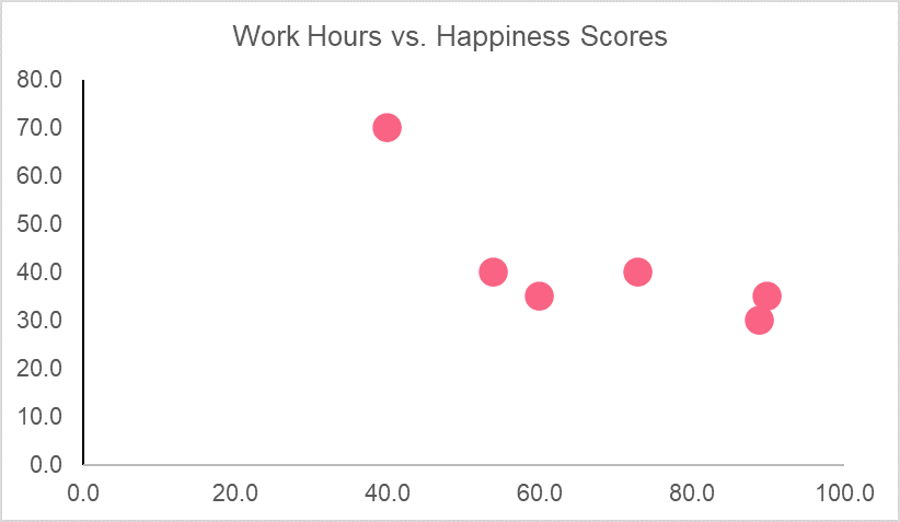
Let’s take a deeper dive into correlation by going through a practice problem step by step. First, we take two variables like the ones listed in the table below.
| Observation | Happiness Score | Work Hours |
| 1 | 89 | 30 |
| 2 | 90 | 35 |
| 3 | 54 | 40 |
| 4 | 60 | 35 |
| 5 | 73 | 40 |
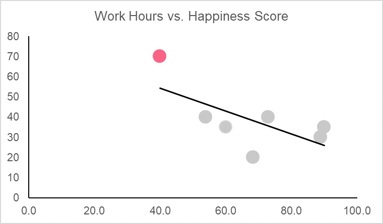
| 6 | 40 | 70 |
Here, we have a fictional data set that looks at happiness scores out of 100 and the number of work hours that individual has in a week. The first step in determining correlation is plotting the data set. This can give us an idea of whether or not the variables are related because those with perfect correlation should be on the 45 degree line.
Now, let’s calculate the correlation coefficient of these two variables. We start by calculating the mean and move through the steps.
| Observation | Happiness Score | Work Hours | 
| 
|  |  |  |
| 1.0 | 89.0 | 30.0 | 21.3 | -11.7 | -248.9 | 455.1 | 136.1 |
| 2.0 | 90.0 | 35.0 | 22.3 | -6.7 | -148.9 | 498.8 | 44.4 |
| 3.0 | 54.0 | 40.0 | -13.7 | -1.7 | 22.8 | 186.8 | 2.8 |
| 4.0 | 60.0 | 35.0 | -7.7 | -6.7 | 51.1 | 58.8 | 44.4 |
| 5.0 | 73.0 | 40.0 | 5.3 | -1.7 | -8.9 | 28.4 | 2.8 |
| 6.0 | 40.0 | 70.0
| -27.7 | 28.3 | -783.9 | 765.4 | 802.8 |
| Average | 67.7 | 41.7 | Total | -1116.7 | 1993.3 | 1033.3 |


Plugging this into the formula, we get:
[
r_{xy} = frac{-1116.7}{sqrt{1993.3*1033.3}} = -0.78
]
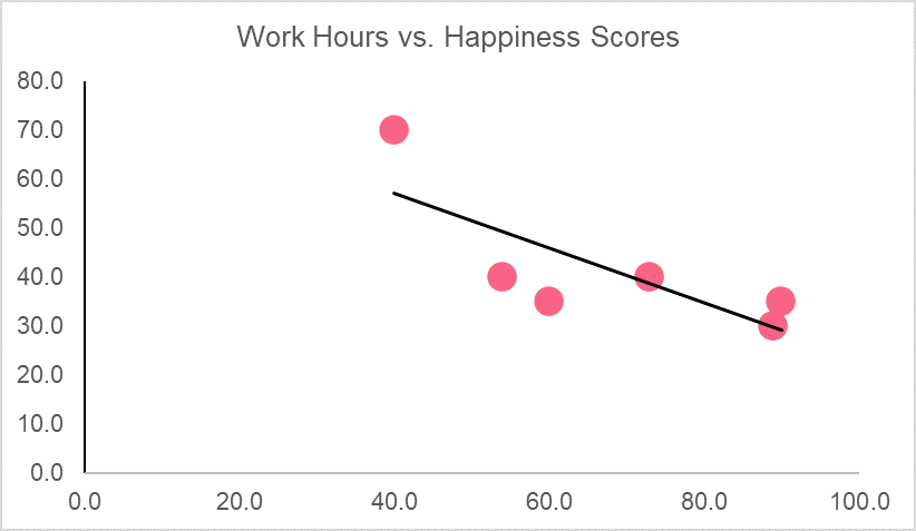
The graph, along with the correlation coefficient, tells us that there is a strong negative relationship between happiness scores and work hours. Meaning, as work hours go up, happiness scores go down and vice versa.
If we wanted to make predictions about happiness scores, we would have to find the following.
| Y standard deviation | 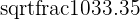 = 14.38 = 14.38 |
| X standard deviation | 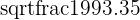 = 19.97 = 19.97 |
| Slope of regression line |  = -0.56 = -0.56 |
| y-intercept |  = 79.57 = 79.57 |
| Regression line | y = 79.57 - 0.56x |
Predicting a score for someone who works 20 hours, we get,
[
y = 79.57 - 0.56*(20) = 68.4
]
A happiness score of 68.4.
We just used our data to try and predict a value that was not included in our original data set. However, we could also pick a value included in our data set and see what our model predicts. These predictions have a special name in statistics and are summarized below.
| Term | Definition | Example |
| Interpolation | Predictions from values within our dataset | A happiness score of 60 |
| Extrapolation | Predictions about values outside our dataset | A happiness score of 100 |
Did you like this article? Rate it!