Chapters
Constructing Box Plots
In this section, you will learn the basics of box plots, also called boxplots. In previous sections of this guide on descriptive statistics, you learned the fundamentals of statistical measures, including the mean, median and interquartile range.Using what you’ve learned about these statistical measures, you’ll learn how they’re involved in the calculation of box plots. In addition, we’ll also teach you the rule of thumb for interpreting any box plot.


Patterns in the Data
In the examples used in this guide, we typically provide you with fictitious data sets that have anywhere between 3 to 20 observations. In these small data sets, it can sometimes be easier to spot patterns because all the information is visible on one page. This, however, is often not reflected in the real world.
There are approximately 7.8 billion people on the planet, leaving statistical traces on the world from the moment their birth is recorded. The world is filled with not only 3 or 20 observations, but billions of observable data waiting to be collected. The branch of statistics that often deals with observations in the millions is called big data.
As you start to deal with larger and larger data sets, patterns in the data can be harder to pin down. It can be helpful to start by understanding the most common patterns statisticians try to find in statistics.
Distribution
A distribution, which is often plotted, describes where the data fall and how they are spread. There are many different ways to describe a symmetric distribution, but there are a couple of common ways statistics describes distributions, found below.
A symmetric data set is one that has a symmetric distribution. This means that, if you were to divide the data set down its mean or median, each side would mirror the other. As discussed in other sections, a symmetric distribution is often the mark of a normal distribution.
Skewness is another way of describing patterns in a data set. Specifically, skewness is a term used whenever many observations in the data set occur at either side of the spectrum. In general, data can either be skewed “right” or “left,” meaning that there is higher concentration of observations at higher values or a higher concentration at lower values, respectively.
Box plots are a way to visualize distribution because it uses measures of central tendency and variability to display data.
Constructing a Box Plot
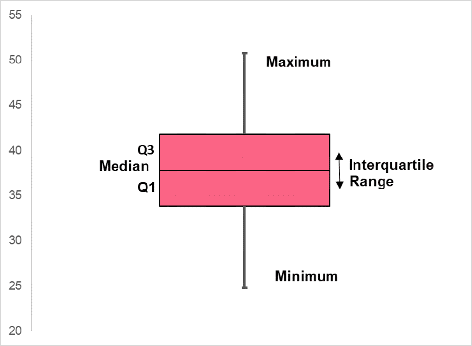
In order to construct a boxplot, you must calculate the interquartile range, or IQR, of a data set. As discussed in previous sections, an IQR shows where the majority of the data lie and is found by calculating the quartiles of a data set. Below, you’ll find a recap of how the IQR is calculated.
| Measure | Calculation |
| Q0 | Minimum of a data set |
| Q1 | 25th percentile |
| Q2 | 50th percentile |
| Q3 | 75th percentile |
| Q4 | Maximum |
As a reminder, percentiles are values for which a certain percentage of the data lie below. The 25th percentile, for example, indicates the value for which 25% of the entire data set falls below. The IQR is found by subtracting Q1 from Q3, or the 25th percentile from the 75th.
A boxplot, also called a box-and-whisker plot because of its shape, typically looks like the image below.
Boxplots and Normal Distributions
Please note that the minimum and maximum in many programs are often not the actual minimum and maximum found in the data set, but rather a certain number of standard deviations away from the IQR. This is done to highlight any outliers that might be in a data set.
Outliers are data points that are very unlikely to occur in a certain distribution. Outliers and boxplots can most easily be illustrated through a normal distribution. Discussed in further detail in other sections, a normal distribution is a distribution that follows a certain set of assumptions and rules. One of these rules is known as the 68, 95, 99.7 rule.

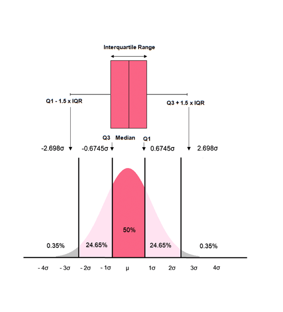
Because we know that the IQR contains 50% of the data in any data set, we can calculate how many standard deviations away from the mean each quartile is located at. The calculation isn’t too important, so we’ll summarize below the rules to follow when your data follows a normal distribution.
| Measure | Calculation |
| Q0 | Q1 - 1.5 * IQR |
| Q1 | 0.6745 standard deviations away from Q2 |
| Q2 | 0 standard deviations |
| Q3 | 0.6745 standard deviations away from Q2 |
| Q4 | Q3 + 1.5 * IQR |
While this may look like gibberish, it is easily understandable by looking back at the image above which equates the boxplot to the normal distribution. Looking at the image, 50% of the data, or the IQR, falls within 0.6745 away from the median. Together, this region is equal to 1.35 standard deviations, which we get simply by 0.6745 + 0.6745.
The minimum, Q0, is 1.5 * 1.35 standard deviations away from Q1 and Q3. And, of course, because the median is equal to the mean it lies at the centre of the distribution, 0 standard deviations away from itself.
Did you like this article? Rate it!


Can you help me answer my activities