Frequency Part 3
In previous sections, you learned about frequency. Specifically, we taught you the differences between cumulative and relative frequency, as well as the two types of relative frequency: row and column frequencies. In addition, we also showed you the main methods of visualizing data, which include dot plots, histograms and frequency polygons. Here, we’ll go over how to interpret histograms.


Absolute, Cumulative and Relative
As a reminder, frequency is generally defined as the number of times something occurs. There are three main types of frequency, which are absolute, cumulative and relative frequency. Absolute frequency is simply a normal frequency, which tells us the number of times something has occurred, also known as the “count.”
The relative frequency is the proportion between a value and a total, while the cumulative frequency is the sum of relative frequencies. In the table below, you’ll find some general information about these frequencies as a reminder of what each is and how to find them.
| Absolute | Relative | Cumulative | |
| Notation | \[ f_{i} \] | \[ n_{i} \] | \[ F_{i} \] |
| Calculation | Count = \[ f_{i} \] | \[ n_{i} = \] \[ \frac{x}{f_{i}} \] | \[ \Sigma n_{i} \] |
| Use | Information about the whole data set | Information about what proportion a value is of the whole data set | Information about what proportion one or more relative frequencies are of the whole data set |
It’s important to note that relative frequency is also divided into row and column frequencies. You’ll find a description in the table below.
| Row | Column | |
| Calculation |
|
|
| Use | Information about the proportions within the row | Information about what proportions within the column |

Interpreting Histograms
Interpreting data, while sounding like a complex topic, involves simply identifying patterns within a data set. While easy to define, interpretation is viewed by many to be the most difficult part of statistics. The human brain is notorious for constantly seeking out patterns - however, this doesn’t necessarily mean that it is good at it. Like many things, practice makes perfect when it comes to interpreting data.
Recall that histograms display information about two quantitative variables, where the horizontal axis presents a quantitative variable in intervals and the vertical axis presents a quantitative variable’s frequency. One of the main reasons why histograms are used for displaying frequencies is because it displays a data set’s distribution. Below, you’ll find an example of a histogram.
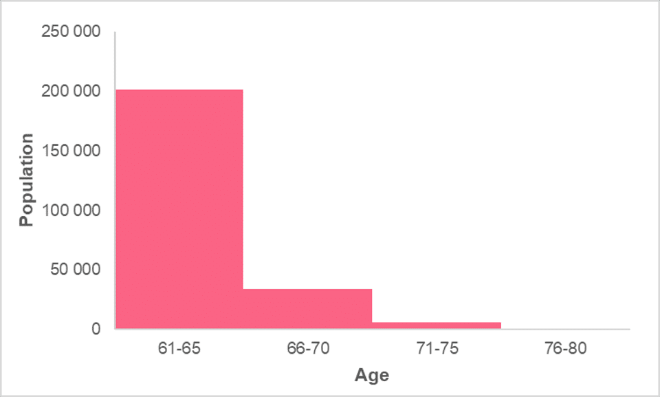
While simple interpretation includes comments about the comparison of the magnitudes of each interval, such as the fact that the age group 61-65 is the largest, there are other methods of interpreting a histogram. These have to do with how the data is distributed, which include three main properties:
- Centre
- Spread
- Skew
These three characteristics are the three main descriptors in descriptive statistics. Regardless of whether you’re using measures such as the average and variance or visualizations such as a histogram, the majority of your analysis will rely on these three characteristics. In the table below, you’ll find the definition of each characteristic.
| Characteristic | Interpretation |
| Centre | The centre describes the centre point of the data. If there is one, you should describe:
|
| Spread | The spread of the data is how the data is distributed around the centre. You can use things like:
|
| Skew | The skew of the data is when a large portion of the data is located to one side while there are a few extreme values to the other side. You can describe skew as:
|
While this is by no means the sole characteristics you can see in a data set, they do make up the bulk of descriptive statistics.
Centre
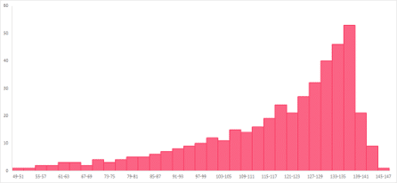
The centre of the data is usually captured by measures of central tendency. This is because measures of central tendency strive to capture the centre point of the data in different ways. While median and mean are values calculated from the data, mode is a measure that benefits from using frequencies. Let’s use the histogram in the image below as an example.

Looking at the graph, we can see that there is one centre, located at the peak in the middle of the graph. It is located between 91 and 99, where we will most likely find the measures of central tendency.
Spread
Spread tells us how the data points are spread around the centre. In this guide, we have mostly used the mean and median as our centre points. This is because, in general, measures of variability work hand-in-hand with mean and median. Let’s use the histograms below as examples.
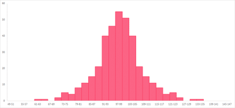
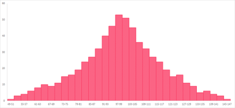
From these histograms, you can see that the data has about the same centre, located between 91 and 103. However, the data points of the histogram on the left are closely located around the centre value. The histogram on the right, on the other hand, shows data points that are much more evenly spread around the centre.
In other words, the range is less in the histogram on the right, or has less spread. The histogram on the right has more spread, or more range, in comparison.
Skew
Skew is generally described as asymmetry. Symmetry means that, if you were to draw a line down the middle of a graph, each side would be a mirror image of the other. There is rarely perfect symmetry in a data’s distribution, so keep in mind eyeballing will only give you a rough idea. More commonly, data sets have skew: a right or a left skew.

The first histogram has a left skew and the second one has a right skew. The right skew on the histogram located to the right means that there are a few values located the right with a higher frequency, while the majority of the data are located to the left, called a “tail” because of its resemblance to a tail.
The histogram with the left skew, located to the left, has a few, high-frequency values on the left while the majority of the data, or the tail, trails to the right. The effect on the measures of central tendency are summarized in the table below.
| Skew | Effect |
| Right Skew | The mean is larger than the median |
| Left Skew | The mean is smaller than the median |
Did you like this article? Rate it!


Can you help me answer my activities