Chapters
In other sections of this guide on descriptive statistics, we explained the fundamental and intermediate aspects of frequency and its visualizations. This included finding absolute, row and column frequencies, as well as constructing charts such as a frequency polygon. Here, we’ll delve into more advanced topics in the construction of frequency polygons and histograms as well as provide some problems for you to practice your skills.


Group Frequency
So far, we’ve discussed frequency and histograms in relation to a single variable. If you recall, this type of analysis is called univariate analysis because we are only investigating one variable. For example, say you have data on the weight of college students where the first four rows are presented below.
| Observation | Weight in Kg |
| 1 | 69 |
| 2 | 54 |
| 3 | 78 |
| 4 | 85 |
If we wanted to analyse the variable of weight, we could use measures of central tendency, variability, and charts like the histogram to try and make interpretations on the weight of college students. For example, we could calculate the mean weight of college students in our data set and how variable their weights are.
While this can be the entire analysis in itself, it’s very common that in statistics, univariate analysis is used in data sets with multiple variables in order to conduct an initial exploration of that data. This is called exploratory analysis because it is performed in order to understand what the data actually contains or looks like.
Descriptive statistics don’t just deal with univariate and exploratory analysis, however. The table below gives a quick summary of the types of analysis you can perform in statistics.
| Type | Exploratory Analysis | Univariate Analysis | Bivariate Analysis | Multivariate Analysis |
| Definition | When you study the characteristics of one or more variables in order to understand their characteristics. | When you study one variable, you are performing a univariate analysis. | When you study two variables and the relationship between them. | Studying two or more variables and the relationships between them. |
| Example | Calculating the mean or identifying a skew in the variable of weight. | Analysing the weight of college students. | Analysing the weight of college students and another quantitative or qualitative variable, such as age or sex. | Analysing the weight of college students and, for example, age and sex. |
Continuing with our example, let’s say we don’t just have data on the weight of college students but also, as mentioned in the table, information on age and sex. As you’ve seen before, instead of presenting all the rows of our data set, which can be hundreds or thousands of data points long, we can present our data as grouped data as is done in the table below.
| Weight Group in Kg | Frequency |
| 29-39 | 24 |
| 40-50 | 539 |
| 51-61 | 2029 |
| 62-72 | 2379 |
| 73-83 | 2314 |
| 84-94 | 2087 |
| 95-105 | 586 |
| 106-116 | 41 |
| 117-127 | 1 |
| Total | 10000 |
As we can see, instead of presenting data on 10,000 observations, we can condense the data into 9 different groups for which we give the group frequency. If we were to plot this data, it would look like the following.

Using what we know about the interpretation of histograms, we can see that the histogram suggests there are two centres, illustrated by the two peaks known as modes. While many of the histograms we’ve discussed are unimodal, meaning they have one centre, this bimodal distribution suggests that there are two groups with different centres. This is where it can be helpful to move from a univariate into a bivariate or multivariate analysis.
Histograms and Frequency Polygons for Two Variables
Histograms can be useful in displaying data for more than one variable as well. This is usually done to compare one variable with two or more categories or to compare two variables for one given category. In the previous example, if we wanted to look at the distribution of weights for two different colleges, we could plot these distributions on the same histogram.
More often than not, a histogram with two or more modes signals towards differences of groups within the variable. Take a look at the table below.
| Female | Male | Total | |
| 29-39 | 24 | 0 | 24 |
| 40-50 | 539 | 0 | 539 |
| 51-61 | 1996 | 33 | 2029 |
| 62-72 | 1958 | 421 | 2379 |
| 73-83 | 462 | 1852 | 2314 |
| 84-94 | 21 | 2066 | 2087 |
| 95-105 | 0 | 586 | 586 |
| 106-116 | 0 | 41 | 41 |
| 117-127 | 0 | 1 | 1 |
Notice how the weights of females and males follow different patterns. In fact, the data in the “total” column is what we displayed in our histogram earlier. If we split the data into two different categories for the variable of gender, we can see that the differences between the two groups explains the two modes in the earlier histogram.

Problem 1
Based on the following summary of a set of data, what type of analysis could you perform?
| Variable | Variable Description | Variable Type | |
| 1 | ID | Observation ID | - |
| 2 | Class | Grade level | Qualitative |
| 3 | Weight | Weight in kg | Quantitative |
| 4 | Age | Age in years | Quantitative |
Solution Problem 1
While there are many different answers you could have responded with for this problem, some sample answers are provided below.
- An exploratory analysis of variables 2 - 4
- A bivariate analysis between weight and age or weight and class
- A multivariate analysis between variables 2-4
Problem 2
Looking at the table below, what type of chart would you recommend:
- A histogram
- A histogram with two variables
- A frequency polygon
| Age Group | Male | Female |
| 10-19 | 224 | 450 |
| 20-29 | 139 | 160 |
| 30-39 | 196 | 333 |
| 40-49 | 958 | 221 |
| 50+ | 662 | 852 |
Solution Problem 2
Because you have information about two values within the categorical variable of gender, you can either do a histogram or a frequency polygon displaying two variables.
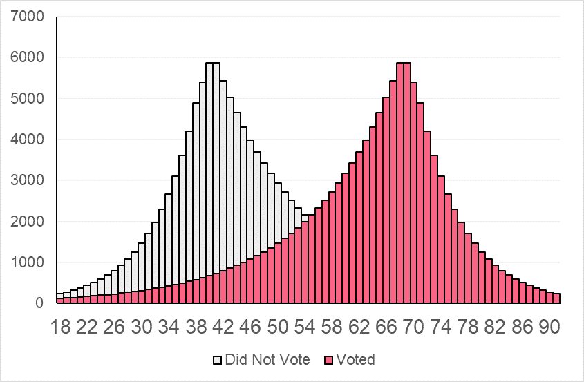
Problem 3
Based on the table below, construct a histogram with two variables.
| Age Group | Voted | Did Not Vote |
| 18-27 | 1811 | 5176 |
| 28-37 | 3909 | 23391 |
| 38-47 | 8440 | 49118 |
| 48-57 | 18222 | 24790 |
| 58-67 | 39339 | 11483 |
| 68-77 | 39902 | 5319 |
| 78-87 | 9463 | 2464 |
| 88-97 | 1218 | 563 |
Solution Problem 3
Your histogram should look something like the image below.
Did you like this article? Rate it!


Can you help me answer my activities