Chapters
In the previous section on histograms and cumulative frequency polygons, we walked you through row and column frequency and how you could plot these frequencies by building dot plots, histograms and frequency polygons. In addition, we also introduced the basics of interpreting these plots. In this section, we’ll dive deeper into how to interpret histograms as well as provide you with some practice problems.


Frequency Overview
Recall that there are three main types of frequencies: absolute, row and column. In the table below, you’ll find a brief summary of each as well as a description of when they should be used.
| Calculation | Description | Uses | |
| Absolute | \[ \frac{f_{i}}{n} \] | The amount of times a variable occurs out of the total sample size | When you want to compare variables between each other compared to the total |
| Row | \[ \frac{f_{i}}{n_{row}} \] | The frequency of a variable out of the row total | For comparison of one factor across the row total |
| Column | \[ \frac{f_{i}}{n_{column}} \] | The frequency of a variable out of the column total | For comparison of one factor across the column total |
As you can see from the table above, frequencies can be used on a number of occasions. In fact, the application of frequencies can be seen in data visualizations such as dot plots, histograms and frequency polygons. Take a look at the three examples given below illustrating the differences between the three.
| Group A | Group B | Row Total | |
| Song 1 | 136 | 195 | 331 |
| Song 2 | 220 | 124 | 344 |
| Song 3 | 100 | 204 | 304 |
| Column Total | 456 | 523 | 979 |
Absolute Frequency
As you can see in the image above, absolute frequency is found by dividing every individual value by the total sample size.

Row Frequency

From the image above, observe the row frequency is simply the individual value over the row total.
Column Frequency
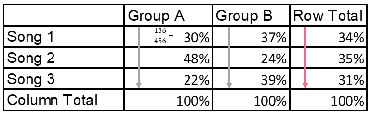
From the image above, you can see the column frequency is simply the individual value over the column total.
Interpreting Histograms and Frequency Polygons
If you recall, histograms and frequency polygons give us information about the distribution of the data set. The distribution of a data set is how the data is spread. The distribution of a data set in descriptive statistics has three main characteristics:
- Centre
- Spread
- Skew
The first two characteristics deal with the main tools of descriptive statistics: measures of central tendency and of spread. These include measures such as the mean, standard deviation, mode and more. Skew, as we’ve discussed in previous sections, has to do with the position of the data points. In our section on absolute cumulative frequency distribution, we discussed these characteristics in depth, whose properties can be summarized in the table below.
| Characteristic | Interpretation |
| Centre | The centre describes the centre point of the data. If there is one, you should describe:
|
| Spread | The spread of the data is how the data is distributed around the centre. You can use things like:
|
| Skew | The skew of the data is when a large portion of the data is located to one side while there are a few extreme values to the other side. You can describe skew as:
|
The interpretation of both boxplots and frequency polygons can be done through these three characteristics.
Problem 1
You want to display data on the different amounts of soda that are bought each day of the week. Given the data table below, build a frequency polygon.
| Monday | Tuesday | Wednesday | Thursday | Friday | |
| Soda Bought | 34 | 69 | 45 | 74 | 96 |
Problem 2
You’re interested in making your data as clear and understandable as possible. Based on the data below, what do you think is the appropriate number of intervals, or “bins”, to group the data in?
| Value | Frequency |
| 10 | 3 |
| 12 | 2 |
| 14 | 6 |
| 16 | 9 |
| 18 | 12 |
| 20 | 38 |
| 22 | 3 |
| 24 | 37 |
| 26 | 4 |
| 28 | 9 |
| 30 | 10 |
| 32 | 5 |
| 34 | 7 |
| 36 | 5 |
| 38 | 8 |
| 40 | 3 |
| 42 | 79 |
| 44 | 24 |
| 46 | 54 |
| 48 | 56 |
| 50 | 77 |
| 52 | 34 |
| 54 | 5 |
| 56 | 56 |
| 58 | 78 |
| 60 | 7 |
| 62 | 4 |
| 64 | 24 |
| 66 | 52 |
| 68 | 7 |
| 70 | 43 |
| 72 | 8 |
| 74 | 6 |
| 76 | 85 |
| 78 | 7 |
| 80 | 67 |
Problem 3
Interpret the characteristics of the distribution of the following histogram. State at least one aspect of the spread, centre and skew. A data table has been provided in order to ease the interpretation.
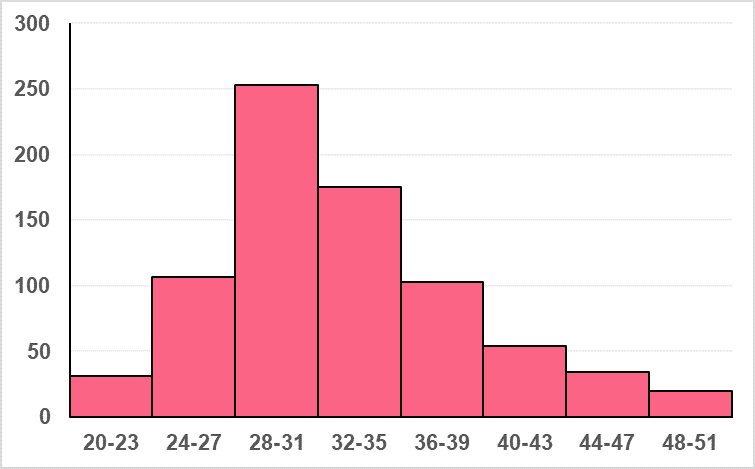
| Shoe Size | Frequency |
| 20-23 | 31 |
| 24-27 | 107 |
| 28-31 | 253 |
| 32-35 | 175 |
| 36-39 | 103 |
| 40-43 | 54 |
| 44-47 | 34 |
| 48-51 | 20 |
Solution Problem 1
In this problem, you were asked to construct a frequency polygon from the data table provided. You should have come up with a chart similar to the one in the image below.

Where we can see the number of sodas bought increases throughout the week, with a slight dip in sales on Wednesday, and the highest number of sales made on Friday.
Solution Problem 2
In this problem, you were asked to decide the appropriate number of bins to display the data. This is an important part of displaying data because, when choosing too few or too many bins, important information about your data can get lost.
Here, a good width for the interval would be 8. This would give us 9 bins, which can be illustrated by the histogram below.
Solution Problem 3
For this problem, you were asked to interpret the characteristics of the distribution below.
As we can see from the table, this distribution charts the frequency of shoe sizes. First, we’ll tackle the centre of the distribution. There is one centre and it is located somewhere between 28 and 35. While we cannot say for sure what the mean, mode and median are without calculating them for the grouped data, we can say that the modal group is 28-31.
The spread is distributed unevenly around the mean, with more of the data set located to the right of the centre than to the left. While the picture suggests that the data are approximately normal, there seems to also be a slight right skew.
Did you like this article? Rate it!


Can you help me answer my activities